Artikel ini saya bagi ke dalam tiga bagian. Pertama tentang penggunaan tanda pemisah desimal dan kedua tentang penggunaan alignment, dan yang ketiga merupakan bagian tambahan.
A. Pemisah Desimal
Perlu dipahami bahwa umumnya pemisah desimal terbagi atas dua jenis. Yang mempergunakan tanda titik (period/decimal point) dan tanda koma (comma/decimal comma) sebagai pemisah. Negara-negara seperti U.S.A, U.K., Australia, New Zealand mempergunakan decimal point. Sementara banyak negara lain seperti Indonesia mempergunakan tanda koma sebagai pemisah desimal.
Untuk laporan di Laboratorium Elektronika Daya (yang saya ampu), sampai hari ini mempergunakan pemisah titik (period/decimal point). Tetapi perlu diingat bahwa untuk pengerjaan tugas akhir dan skripsi harus mempergunakan pemisah berupa tanda koma dan bukan titik.
Untuk memahami sumber-sumber untuk dikutip, periksa terlebih dahulu apakah mengikuti pola penulisan dengan decimal point ataukah decimal comma. Mengingat banyak sekali sumber pengetahuan primer yang berasal dari negara-negara berbahasa Inggris dengan budaya yang hampir sama (anglophone), terutama Amerika Serikat dan Inggris. Mahasiswa diharapkan sudah terbiasa mengenal dan mempergunakan kedua pola penulisan desimal tanpa kesulitan berarti.
B. Alignment
Bagian kedua tulisan ini adalah mengenai format pengetikan, penyelarasan (alignment) tepi kiri dan tepi kanan. Ada beberapa bentuk yang umum dipergunakan, dua yang paling umum akan disampaikan di sini. Yang pertama adalah left alignment / left-aligned / rag right / ragged-right / flush left. Yang kedua adalah justify / justified alignment / full justification.
Untuk laporan praktik Laboratorium Elektronika Daya, format pengetikan yang dipakai adalah justified alignment/rata kiri dan kanan. Bentuk pengaturan seperti ini adalah yang banyak dipakai di dokumen resmi termasuk laporan akademik. Begitu pula dipakai untuk buku-buku dan makalah jurnal di luar dan dalam negeri. Karena itu format ini yang dipakai di Lab Elda. Tetapi sebagai pengetahuan, kita perlu lebih memahami mengenai kedua format yang banyak dipakai ini.
Sebagian besar ketikan pada artikel yang saya buat mengikuti pola format rata kiri (left alignment). Format penulisan (pengetikan) seperti ini banyak ditemui di bahan bacaan di Internet yang berbasis HTML. Sebagai pembanding dapat dilihat format pengetikan di beberapa situs berikut:
- Institute of Electrical and Electronics Engineers (IEEE) Power Electronics Society (PELS) About
- IEC The world of electricity: 1820-1904
- American Society for Engineering Education (ASEE) at 125
- https://www.eecs.mit.edu/news-events/media/katrina-lacurts-awarded-inaugural-soe-distinguished-educator-award
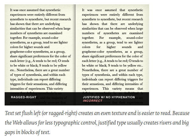
Format left alignment umumnya disukai oleh para pembaca aktif. Karena dengan jarak antar kata yang tetap dan tepi kanan yang tidak selalu sama antar baris, maka akan lebih mudah dibaca (readability) untuk bahan bacaan yang panjang. Pembaca juga akan lebih mudah untuk menemukan pembeda antar bagian tulisan karena tepi kanan yang justru tidak rata.
Format penulisan justified umumnya dipergunakan untuk buku dan materi bacaan yang dicetak. Dengan tampilan tiap paragraf yang rata kiri dan rata kanan seperti kotak, format justified akan tampak lebih rapi terutama untuk dokumen formal. Sekalipun seabagai resikonya, terdapat trade-off yaitu jarak antar kata tidak lagi dapat dijaga tetap sama. Begitu pula jarak antar kata bisa menjadi sangat lebar yang sering disebut sebagai “rivers of white space“, terutama di akhir paragraf. Karena itu biasanya buku-buku diedit oleh para profesional dengan menggunakan pemenggalan suku kata (hyphenate) yang dicirikan oleh adanya tanda hubung di sisi kanan ketikan.
F. Petruzella, Electric Motors and Control Systems, 1st edition. McGraw-Hill Education, 2009.
Berikut beberapa contoh keterangan dengan gambar:
Pada gambar berikut dapat dilihat bahwa jarak (spacing) antar kata untuk format justified tidak selalu sama.
https://www.smashingmagazine.com/2011/08/mind-your-en-and-em-dashes-typographic-etiquette/
Berikut beberapa kutipan langsung yang secara singkat dapat memberikan gambaran mengenai beberapa aspek pemilihan format pengetikan/penulisan.
“When justified alignment is used in books or magazines, there are people that go through each page and manually adjust the spacing to get rid of any of those awkward spacings and even add hyphens if necessary. This is completely unreasonable to do on a website, there are just too many different screen sizes, screen resolutions, and zoom levels to have justified text on a website without having awkward alignment for at least someone.
Why are books and magazines fully justified?
Books and magazines are by far the most common source of justified text out there. They love using justified text because it looks more visually appealing, and looks more professional.
It can even save on printing costs due to the pages saved in making sure each line of text is used to its full width.
Each line of a book or magazine usually have enough words so that the problems of justified alignment don’t happen. Each line of text in a book typically has around 60 characters per line, which is about 10 words per line. This enables books to have the visual appeal of justified text, and the user experience of left-justified text.”
~ https://thewebsitearchitect.com/does-center-aligned-text-matter-for-accessibility/
“Left is the most popular and default text alignment. Its the best for readability and user experience because of the way our eyes read.”
~ https://thewebsitearchitect.com/does-center-aligned-text-matter-for-accessibility/
“You’ll still see large blocks of justified text in certain magazines and books (and of course newspapers). Notice how the negative space forms Rivers (when your eyes connect the spaces into paths that distract from the information) and scattered gaps because the text is forced to fill the margins.
Rivers are distracting and unnecessary. That’s why it’s best to use Left Align for paragraphs of text.”
~ https://www.shutterstock.com/blog/justify-vs-align-guide-to-type-alignment
Here are some tips for achieving smooth, readable justification:
+ The more words that fit on a line, the fewer problems you’ll have. Achieve this by making the line length a bit longer, or by reducing the point size of your type, even if only by a fraction.
+ If necessary, edit the text itself to fix lines that are too open or too tight. Try to reduce the number of lines with hyphenated endings, particularly if there are more than two in a row. It’s always possible to substitute short words for longer ones or trim convoluted sentences–your copywriter may welcome the chance to improve the writing, as well as the design!
+ Become familiar with your software’s hyphenation and justification (H&J) settings. You can usually adjust the word and character spacing parameters, as well as hyphenation preferences.
~ https://www.fonts.com/content/learning/fontology/level-2/text-typography/justified-type
“If someone insists that fully justified text is better than left-aligned text, tell them they are wrong. If someone else tells you that left-aligned text is better than justified text, tell them they are wrong.
If they are both wrong, then what’s right? Alignment is only a small piece of the puzzle. What works for one design might be inappropriate for another layout. As with all layouts, it depends on the purpose of the piece, the audience and its expectations, the fonts, the margins, and white space, and other elements on the page. The most appropriate choice is the alignment that works for that particular design.”
“Browsers never render justified text as expected. They don’t have the necessary algorithms to properly set the spacing between words and even individual letters. Making a text justified might make your designs look coherent in the design software but it never displays like that in real life. In a browser justified text often creates gaps between words and it looks odd.”
~ https://bootcamp.uxdesign.cc/5-tips-to-become-a-typography-pro-199308173159
Bacaan lebih lanjut:
- Does Text Alignment Matter For Accessibility And Usability?
- Justified vs. Rag Right
- Text Alignment
- https://ontariotraining.net/to-justify-or-not-to-justify-text/
- 5 tips to become a typography pro
- Mind Your En And Em Dashes: Typographic Etiquette
- Justified Type
- Hyphenation and Justification
- Use Ragged Right or Full Justification Appropriately
- 5 Ways to Not Over Stretch the Last Line of a Justified Paragraph
- Eliminate white space in Word documents with automatic hyphenation
Keywords: experiencing (UX),user interface design (UI), readability, spacing, alignment, rag right, justified, hyphenate, hyphenation, hyphenated,
C. Tambahan
Untuk mengetahui filosofi dan inti/dasar dari suatu laporan percobaan laboratorium untuk bidang engineering maka menarik untuk mempelajari yang diungkapkan oleh Robert Irish dalam bukunya berikut ini.
R. Irish, Writing in Engineering: A Brief Guide (Short Guides to Writing in the Discipline), 1st ed. Oxford University Press, 2016.
L. Finkelstein, Pocket Book of Technical Writing for Engineers & Scientists (McGraw-Hill’s Best: Basic Engineering Series and Tools) 3rd (Third) Edition. McGraw-Hill Science/Engineering/Math, 2007.
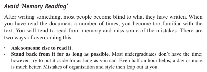
Salah satu tantangan dalam memeriksa pekerjaan kita sendiri adalah justru karena kita terlalu akrab dengan yang kita kerjakan sendiri. Alih-alih benar-benar membaca apa yang tertulis, kita ‘membaca’ dari ingatan kita tentang apa yang kita ingat saat kita ‘membaca’. Karena itu tidak aneh jika ditemui bahwa yang tertulis berbeda dengan yang kita anggap kita baca. Hal ini bisa disebut sebagai ‘memory reading‘.
H. Silyn-Roberts, Writing for Science and Engineering: Papers, Presentations and Reports (Elsevier Insights), 2nd ed. Elsevier, 2012.
#fairUse #educationalPurposes
Sebagaimana isi kutipan, solusinya antara lain adalah dengan meminta orang lain membaca (memeriksa) hasil pekerjaan kita. Terutama orang yang belum pernah membaca atau belum akrab dengan hasil pekerjaan kita. Termasuk untuk laporan percobaan laboratorium, tugas akhir, dan skripsi.
Sebagai tambahan, berikut beberapa dokumen yang dapat dijadikan sebagai pembanding untuk mengerjakan (menyusun) laporan praktikum laboratorium secara umum.
Beberapa contoh laboratory handbook, laboratory report guide (dan sejenisnya) sebagai pembanding, dapat dilihat di sini:
- http://ecelabs.njit.edu/ece494/lab_report_b.php
- https://ece.charlotte.edu/sites/ece.charlotte.edu/files/media/ECGR3155-EXPERIMENT%204-DIODES%20AND%20BRIDGE%20RECTIFIERS.pdf
- https://ece.northeastern.edu/courses/eece2412/2016fa/lab/EECE2413_syllabus.pdf
- https://dunham.ece.uw.edu/ee331/LabRev/EE331LHBrev6.pdf
- https://www.seas.upenn.edu/~jan/LTspice/ESE216LTSpiceDC&TransientSimulations.pdf
- Lab Report – IMRaD Style - Quick Guide
- IMRAD: What goes into each section
- https://stanford.edu/class/ee267/WIM/TechWritingTips.pdf
- https://owl.purdue.edu/owl/graduate_writing/graduate_writing_topics/graduate_writing_organization_structure_new.html
IEEE style:
- IEEE Editorial Style Manual
- IEEE Editorial Style Manual for Authors [PDF]
- IEEE Mathematics Guide [PDF]
- IEEE Reference Guide [PDF]
- IEEE Citation Style: Datasheet
KBBI-PUEBI:
Sumber gambar: https://worldnewsera.com/news/education/5-tips-to-improve-your-academic-writing/